Creating a
Design System

Creating a
Design System

From Semantic colors to Figma variables and Code Connect, here is how I took it to the
next level.

Top

After joining Brightly, the company transitioned from Adobe XD to Figma. Given my extensive experience with Figma, I not only led several training sessions but also spearheaded the migration of our designs from XD. At the time, we had the beginnings of a design system which was somewhere between a style guide and a true design system. This transition presented the perfect opportunity to move it into a complete design system.


Previously, I’d been part of a team developing a design system for a health insurance company, so I came with relevant experience. Additionally, I had the chance to collaborate with two design system leads from Siemens (a global company with over 300,000 employees and numerous products) to better understand their robust system. This partnership began when I was tasked with integrating one of our products into their world-class design system, which I used as a foundation to create a similar approach for ours.

Semantic Colors

The foundational styles had been in place for years, so this work reflects my system-building skills rather than my personal UI preferences.


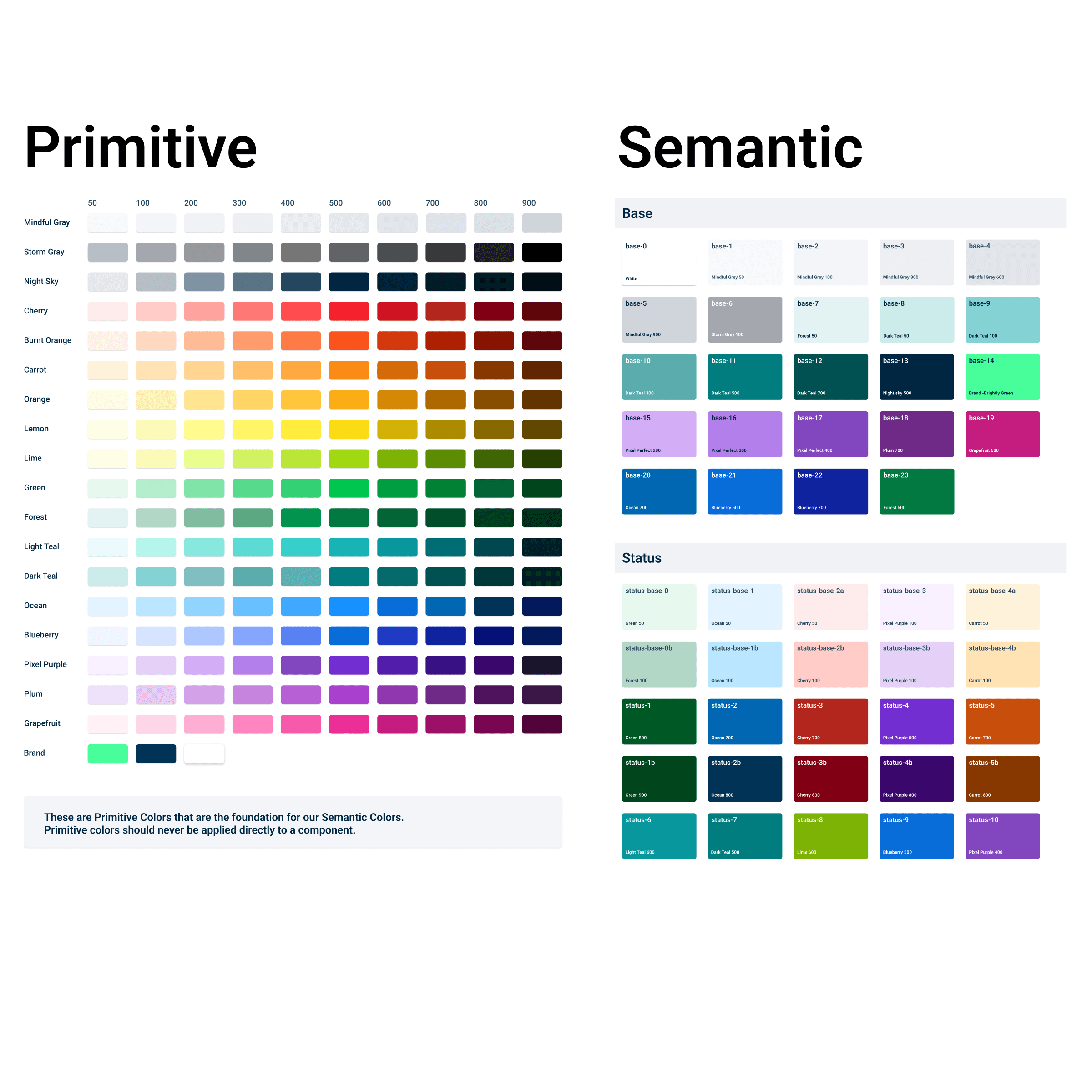
My first step was creating Primitive and Semantic colors. Primitive colors are a refined color palette not directly applied to components or designs. When we decide to use a Primitive color in design, it becomes a Semantic color with functional names like base-1 or border-2. This system provides:

  1. Clarity - Designers easily know where each color applies.

  2. Flexibility - A Primitive color, like Ocean 300, can serve multiple functions (e.g., text-3, border-4). Adjusting border-4 (e.g., darkening it to Ocean 400) won’t affect text-3 or the original Ocean color.
Variables

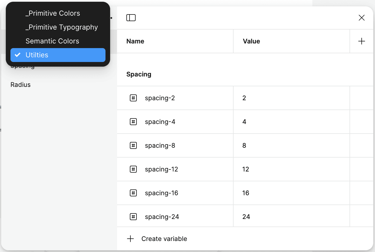
We converted these colors into variables, excluding Primitive colors from the published design system. Using variables instead of fixed styles allows us to modify Semantic colors without impacting Primitive colors, as previously mentioned. This approach also enables flexibility with modes, such as light and dark themes, allowing designers or developers to toggle an entire design with a single switch.

In addition, we introduced variables for spacing and radius, giving designers quick access to predefined options for efficiency and consistency. We also created styles for shadows/elevations, gradients, and variables for line spacing and font sizes.

Slots and Other Elements

Slots and Other Elements

Slots and Other Elements

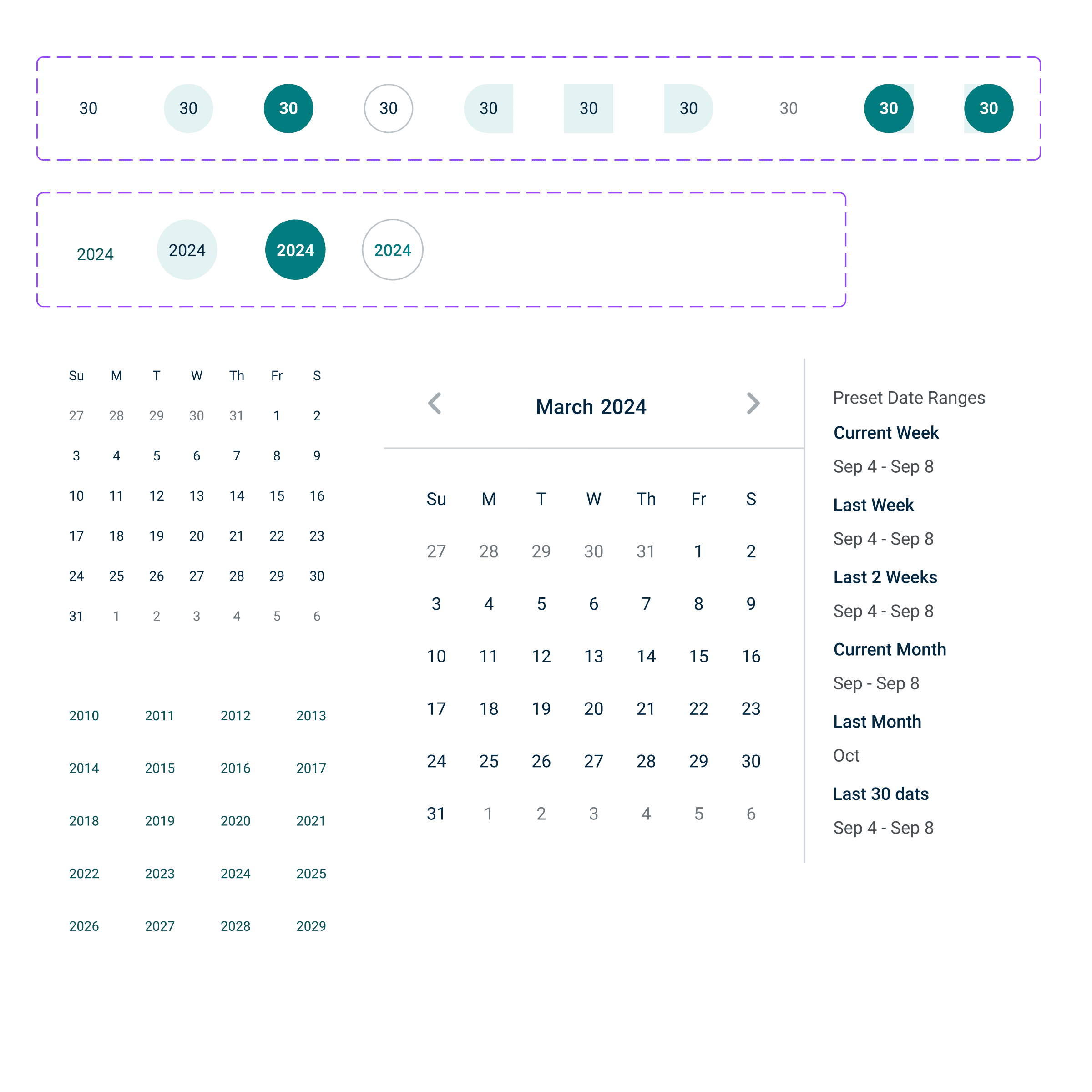
We documented numerous standard design system elements, such as a grid system, standard layout examples, skeleton loaders, progress indicators, overlays, and more.


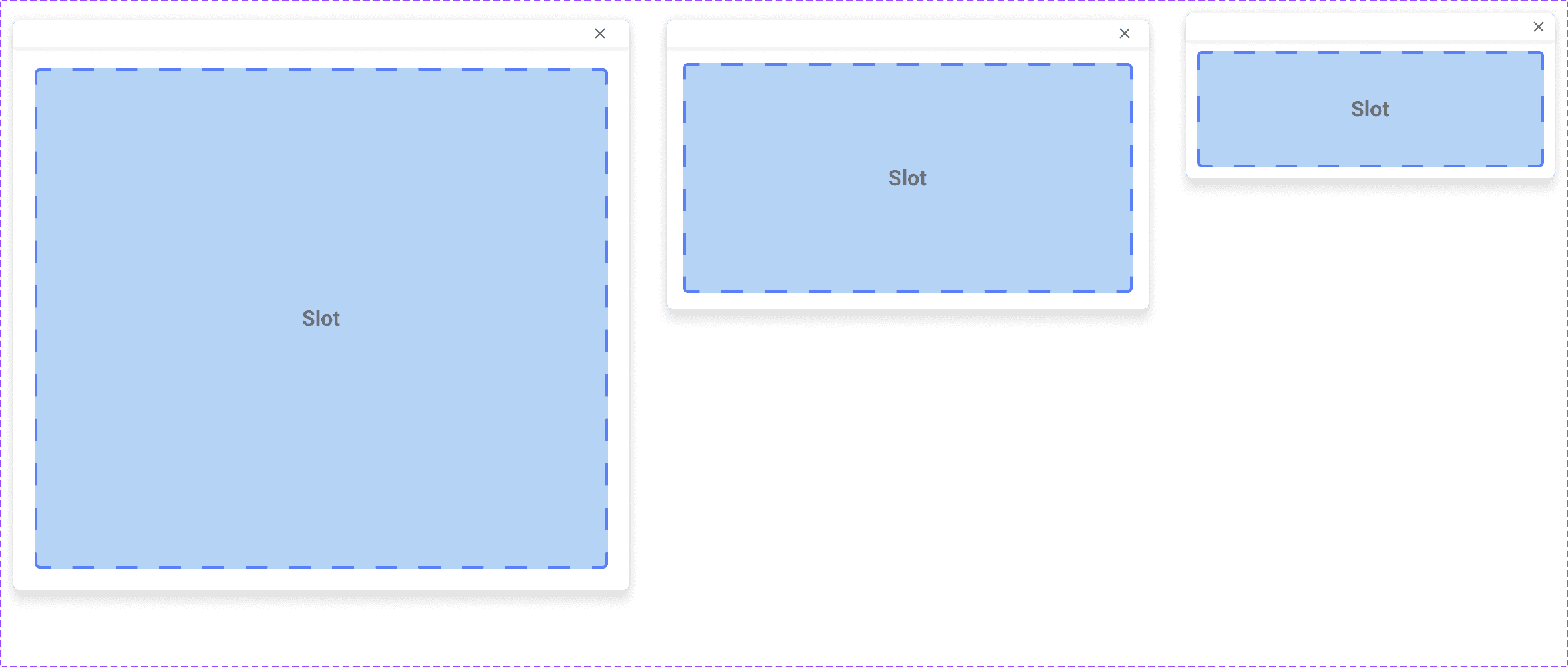
However, a design system can’t standardize every layout or scenario. To address this, we introduced "Slots." For example, with pop-up modals, we provided recommended sizing guidelines. Designers can create content tailored to user needs by designing within the modal size and swapping it into the slot as needed. This approach promotes both efficiency and consistency. We applied slots to elements like side sheets, cards, and widgets..

Bricks: Component Building Blocks

Bricks: Component Building Blocks

Bricks: Component Building Blocks

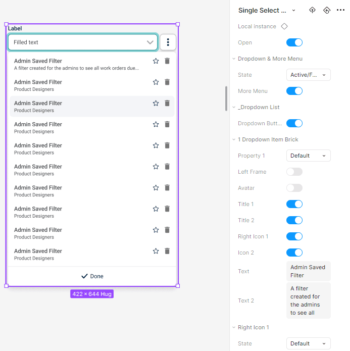
To build complex, highly customizable components, we start with foundational "bricks," similar to atomic design. For example, creating a dropdown component begins with designing list items, including hover states and options to show/hide elements. We then use these items to build a responsive dropdown list and, eventually, a dropdown menu with a button option, incorporating various states for dropdown fields and buttons.


These building blocks allow a single component to serve multiple use cases, reducing the need for a long list of components in the design system..

Complex Components

Complex Components

Complex Components

Assembling the bricks creates a component with its own variants and customization options, while still allowing adjustments to the nested brick components. For example, in dropdown fields, designers can show or hide a tooltip icon or a required icon in the Label brick simply by toggling a switch. This enables designers to go down the list in right column and customize dropdowns precisely as needed while staying within the design system.


We also introduced text and Boolean attributes to make edits quick and efficient..

Working with Dev

Working with Dev

Working with Dev

To create an outstanding design system, a strong partnership with development is essential. A design system in Figma is only valuable if it reaches Storybook and is implemented in the software. I initiated this collaboration by meeting with developers to introduce them to Figma’s Dev Mode.


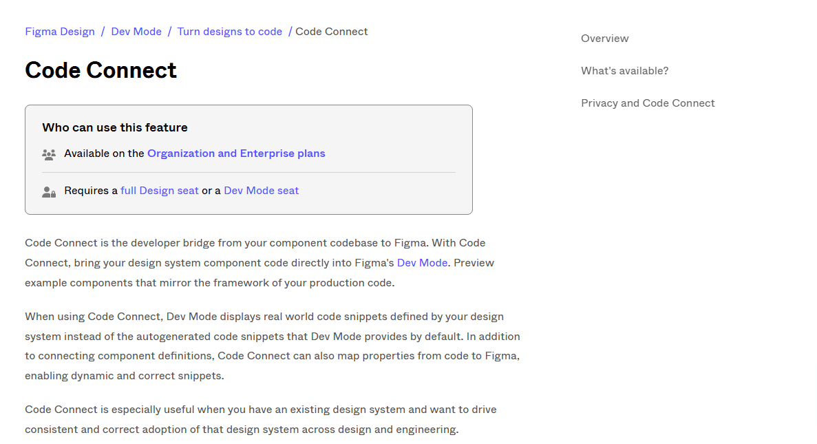
We then engaged the front-end guild, set up regular meetings, and began building components with precision. Additionally, we utilized features like Code Connect to ensure our Figma design system and codebase stayed fully aligned.

Accessibility

Accessibility

Accessibility

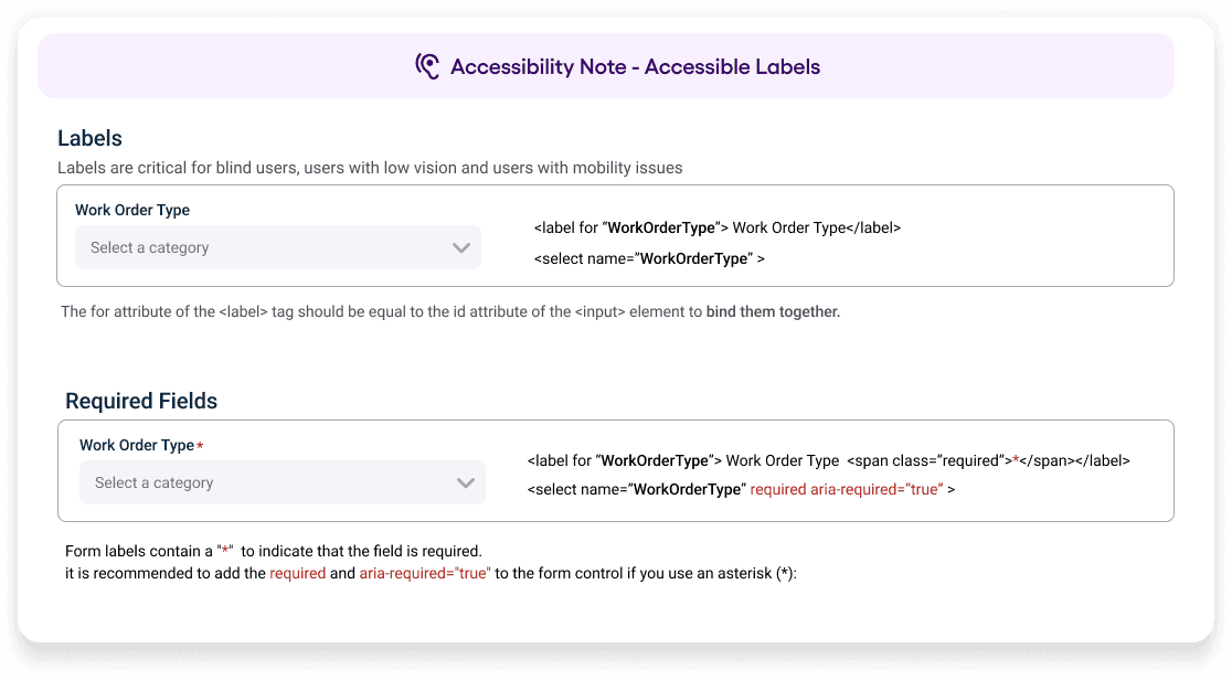
Accessibility is essential in our design system. While some accessibility features are built-in, they can still be overlooked. For instance, a dropdown field might be missing a label when it should have one, or at least the correct ARIA attributes.


To address this, we included accessibility notes in the design system for designers and developers, ensuring consistent adherence to accessibility standards.